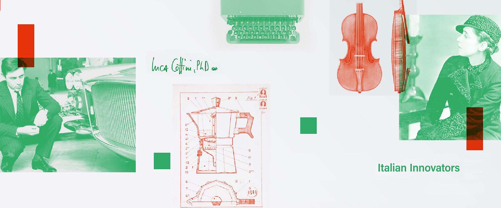
What value does Italian culture and entrepreneurship bring to the contemporary world? Why does Italy represent - still today - an incredibly lively piazza of creativity and innovation? These are the main questions of Italian Innovators’ research: a series of interviews aiming to present Italy’s contribution to the modern world, offering an insider's perspective on its success model.
In this video, Luca Cottini, Associate professor of Italian Studies at Villanova University – USA, interviews Patrizio Cionfoli, Studio Volpi's Director of Design and Interaction: they discuss about design as a holistic approach to innovation, and explore the impact designers have in creating, improving and shaping objects and worlds according to their cultural imagery and own user experience.
Luca Cottini: In your position as creative director, you oversee the 4 phases of a product: discovery, design, development, delivery. What you define as the 4D method. Throughout these stages, design is a visual way of thinking where the creative impulse interacts with the engineering of practical solutions, where aesthetics and functionality merge. As both disegno and progetto, design is a double-hedged force of ingenium, the Latin root for the words “ingenuity” and “engineering”. Leonardo da Vinci of course is the model of this drawing energy enacting objects or experiences that are at once beautiful and useful. We often forget, but his Last Supper was actually an elegant solution for closing a wall in a refectory. In your approach to design, researching, planning, finding, and executing are part of a continuous flow aimed at constructing not just a nice cover for a product, but also and above a meaningful and satisfactory experience. How does this method work? How do you think an object or a product in design terms?
Patrizio Cionfoli: In my role of creative director, I can certainly share what I consider to be the secret ingredient, that “something” special that makes the difference, that sparkle of pure ingenuity that comes through intuition or is simply the result of the combination of creative minds, which at a certain point makes you say: “OK, we’ve nailed it!”
Aesthetics are certainly an important element in the development of a project, but I am very lucky to have an engineering support team that assist us in studying feasibility. Without them we couldn’t talk of “experiences”, but only of aesthetics. At Studio Volpi, like I said, we design experiences, so knowledge of the brand, of its values, its vision and aspirations become indispensable as we move forward with a project. From the initial inspiration to market launch we need to be able to visualise an idea, giving it a shape on which to start an internal discussion between the various brand and technology departments, and without which it would be very hard to interact with the client. The material “shaping” of an idea is what defines the boundary between theory and practice. Studio Volpi has the ability, on one hand, to express great creativity, and on the other hand to show great pragmatism in “doing”. I’d say this is the magic ingredient, an open mind, always.
LC: One of the strengths of your company is an integrated approach to experience. Experience not just as “use” but also as a complex piazza of interactions, or a polyphonic symphony, where multiple perspectives collide and react generating new meaning. Your polyvalent approach to design finds expression in your works in many different spheres like corporate education, medicine, virtual reality, object design and space or event design. How do you design an interdisciplinary and interactive vision of the product in an agile way, breaking silos or compartmentalized approaches? How do you translate such integrated vision of many different user experiences in an elegant, comprehensive, and innovative interface?
PC: I very much like the metaphor of the “polyphonic symphony” because, you see, it involves people. One of the lessons I’ve learned and which I cherish is the beauty of making mistakes: during a live concert mistakes can happen, yet as spectators we’re eager to attend live concerts, precisely for those little “out of sync” moments because they represent all the beauty of human imperfection. Everything sounds great but there’s always a moment when something goes out of order, and that’s when intuition hits us. This is only possible when you work with a team of individuals with open minds and who trust each other.
Sharing competencies, never losing our eagerness to learn, allows to merge these multiple skills and project fields into a single great “polyphonic symphony”. This is possible only through design. Major companies know it and since they started considering Design as a strategic department, their business has grown.
User Interface solutions follow a single product strategy: product and UI are one and the same and they express the same values of design, brand, and signature. The actual gestural action in using a product helps us come up with innovative solutions.
We have changed our way of looking at objects according to the way we use them.
LC: Virtual reality has become a major area of industrial growth. VR has to do with the design of an alternative fictional space, where paradoxically we learn more about reality than in “real” reality. It’s actually the same premise of literary fiction, which is technically a “lie” or a “pretend” space where our suspension of disbelief actually allows us to know more about reality than with reality itself. What is your poetics of virtual reality? Is that just execution or entertainment? What culture, what knowledge do you aspire to create for your users through the fiction of VR?
PC: Virtual reality is an instrument that enhances our design capabilities and allows us to spot potential mistakes and act on them at an early stage, this in terms of shape and details and also with respect to the usage context in the case of large objects. The quality of the imagery has reached incredible levels of definition and realism. VR is an instrument that helps us foresee the outcome of our work by contextualising it. It can support our choices as we recreate the scenery for a showroom, and help us compare aesthetic alternatives in a retail store simulation. We can test the usability of different interfaces, as well as simulate various usage phases of a product. It often happens that the Virtual Reality experience is better than the real-world one, and that might cause some disappointment. Our aim is to re-create reality, and not something better, or fake. VR must reflect reality, otherwise we enter the field of fantasy and entertainment. As I said, the great added-value of such an instrument is the full understanding of the UI in the initial phases of conceptualisation. It’s a great tool supporting the discussion among the designers and between the designers and the client.
LC: The digital transformation and the transition to the Internet of Things are key driving forces of innovation, competitive edge, and improved customer experience, but they are also developing platforms for the creation of value and stories. How does the technical element intertwine with storytelling in the design of an interface, a service, or a product? Can you make some examples?
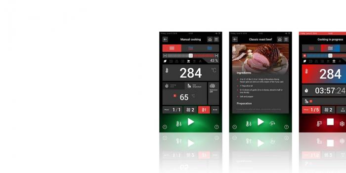
PC: Customer experience has certainly improved over the years, if we think about the evolution of the telephone, or domestic appliances. This consequently modified our physical interaction with the objects we love; technology and material research on one hand, and designers’ vision on the other hand, have helped create intuitive interfaces for professional kitchens, such as the award-winning professional oven from Angelo Po. In addition to a completely customised interaction according to different users profiles and their level of tech-savviness, we developed a cloud system for the online sharing of the entire experience so as to enrich one’s knowledge and that of others. Another very interesting example is the design of a domestic medical dispenser, and its UI experience. We created an analogic-looking device, which aspect could appeal to a target of senior or memory-impaired users, while designing a complex software to remotely manage and monitor medical treatment. The result was a medical product which aspect was very far from the medical world but was instead friendly yet technological at the same time.
LC: Studio Volpi designed project for top clients like, among many, Alessi, Bialetti, BTicino, Duracell, Lavazza, and Pirelli. The project I admire the most was the renovation of the Graziella bicycle (I dedicated quite a few episodes of the show to bicycles), where you took an iconic piece and renovated it maintaining its identity yet re-inventing its appeal. How do you connect the cultural heritage of the product (its deposit of images and meanings, coming from a previous user experience) to new media, new expectations, and changing markets? In your opinion what is a good relationship between style and sustainability?
PC: It’s really an honour for me to be working with major brands who have a great design history. The case of Graziella combines history, intuition and needs: if we take a closer look at the icons of Italian design, we notice that, alongside the industrial need they address, they always also respond to a social need. The introduction of the bicycle on a large scale in the aftermath of WWII helped connect suburbs with the cities and their industrial areas, as superbly described in Vittorio de Sica’s film “Ladri di biciclette” (bicycle thieves). In those years you wouldn’t talk of “storytelling”, but you’d refer to needs: the real need was to have a cheap means of transport, and we wouldn’t talk of sustainability and environmental impact either. I think that the relationship between style and sustainability is the same that we have between quality and product lifecycle: quality, also aesthetic quality, tells who we are and represents our style, our brand values, that inspire trust; Sustainability starts from the first project conceptualisation and continues with the choice of materials, of the production process etc.. There’s a clear trend towards products that last longer. We will be forced to produce less, but better.
LC: Studio Volpi operates in Italy, in Carnago, north of Milan, but has also developing branches in China and in the United States. What is the appeal of an Italian design company for an American market? What return of investment and what additional value does your idea of design generate?
PC: Our strength lies in our way of conceiving ideas and seeing them turn into new products. I don’t believe there is a particular process that can guarantee Italian Style and therefore, success. My design team has the ability to always create something new, unique and original in its concept, form and philosophy. I think that’s what makes us interesting and attractive for the American market. Our added-value is simply our way of being. By being present on the American market we can shorten the distance between our team and that of the companies we work with, be responsive and offer continuity. Over the years we have created a bond with these brands, which continues to grow today.
-
-
-
Prospettive Mar 30, 2020
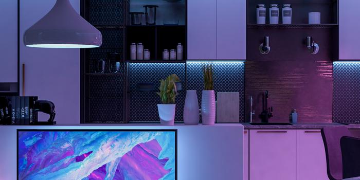
KITCHEN 4.0: HOW DIGITALIZATION IS CHANGING THE RULES
Technological updating and the integration of an interconnected soul are turning modern professional kitchens into a perfect example of the 4.0 industry, where the product and its super digital powers become a tool to improve working conditions, enhance productivity, monitor the processes to achieve better results and create new business models


