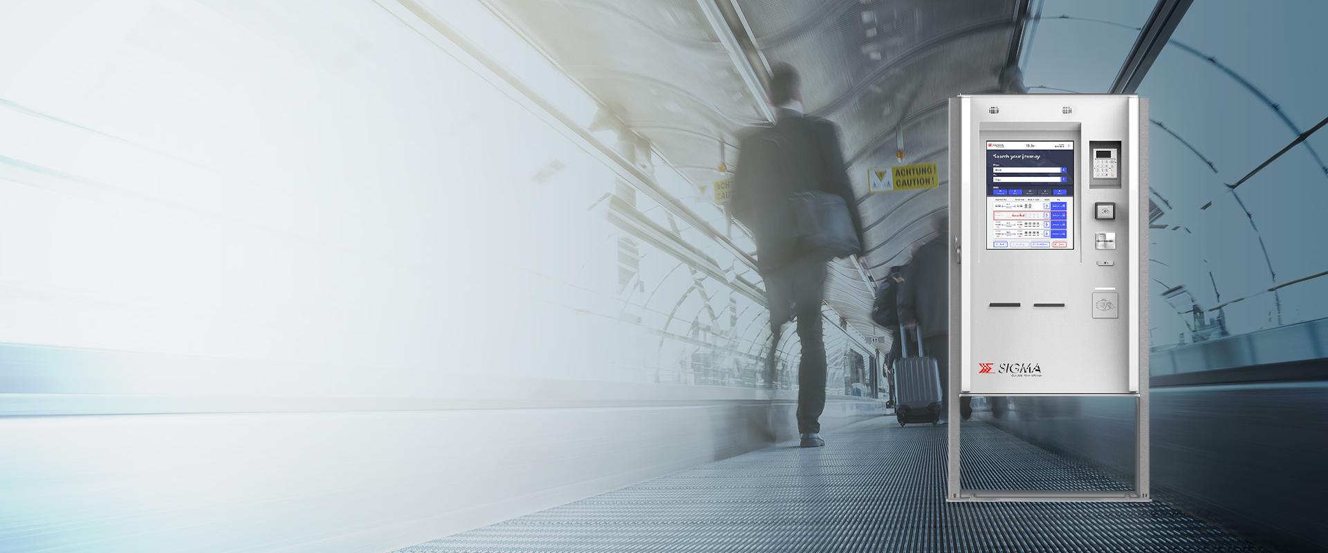
Easy to use ticket vending machine interface
Following the developments in the design and features of their ticket vending machine, Sigma approached Studio Volpi to redesign the interface of their machines based in Sweden. The design needed to address needs of its various user groups such that it can be easily comprehended by all while still accommodating the new features.
SIGMA, a benchmark in ticket vending machines
Sigma is an Italian Company which provides integrated high quality products and services. Sigma’s product range includes self service ticket machines, tolls, parking, security systems, banking automations and train protection systems.
Sigma is market leader in Italy and nowadays in Europe in producing self service ticket vending machines, which have been installed by many rail and public urban transportation operators.

Challenge
PROVIDING A FLEXIBLE AND ACCESSIBLE DESIGN
The core of the new design was flexibility since this design would be adapted by the various brands of the Sigma machines in Sweden.
The challenge was for the interface to be designed to be accessible by both standing and wheelchair users.

On Field Study
UNDERSTANDING THE CONTEXT
In order to understand the interaction with the machine’s interface from the perspective of the actual users of the machine, we conducted a series of interviews and tests in Sweden. The main aim of these interviews was to perceive:
- Who are the users of the machine
- What actions do they perform on the machine and what is their main purpose of use
- What they currently think of the machine and what they would want to machine to have

Data analysis
All data derived from the field interviews was categorised into:
SUBJECT DEMOGRAPHIC
TRAVEL HABITS
TVM USAGE
TVM EXPERIENCE

Ideation and problem solving
Based on the on field study and data analysis, 5 main user groups were defined and a persona was created for each for these user groups. These personas were based on actual users of the machine who were interviewed as a part of the study. Having analysed the needs and frustrations of these personas, use cases were developed which were supported by individual customer journeys.
Wireframing
PROTOTYPING IDEAS TO WIREFRAMES
After an intensive ideation process aided by the tools of design thinking, we defined the features of the new interface in agreement with the client. We created 3 wireframes concepts, each with their unique user flow. These wireframes were tested to narrow down to the most user friendly flow that could access all the machine features and functions in an easy, quick and clear way.

Graphic user interface
DEFINING THE VISUAL IDENTITY
With one of the core challenges of the project being having a flexible interface design, we created visual concepts which could be moulded to fit the identity of the 4 main brands the interface would be implemented for.
Having defined the core graphic strategy we implemented the graphic identity to all the screens that would be needed to complete the user flow.

Testing
BUT, DOES IT WORK?
The most important phase of the project was conducting user tests. With the aim of the project being designing an accessible and easy to use interface, we prepared test prototypes in accordance with the initially defined use cases. The prototype was loaded on the new machine for users to test. The results of these tests helped us understand what could be modified for a better ease of use. Having incorporated these modifications, the final set of screens was delivered for developement.

Sigma's Kos TVM reached the status of "Nominee" at the prestigious UX Design Awards, the global competition with a unique focus on user experience. The project has been inserted in the list of the most important 50 submitted projects, a great result that confirms the value of Sigma's Kos TVM and, more in general, remarks the high level of excellence of the UX and UI projects made by Studio Volpi.


