Friulinox and Hiber, part of Ali Group, are manufacturers of refrigeration systems for over 30 years.
With more than 1 billion euros in annual sales, Ali Group is a leader in professional cooking equipment, in Italy and worldwide.

Assigned task
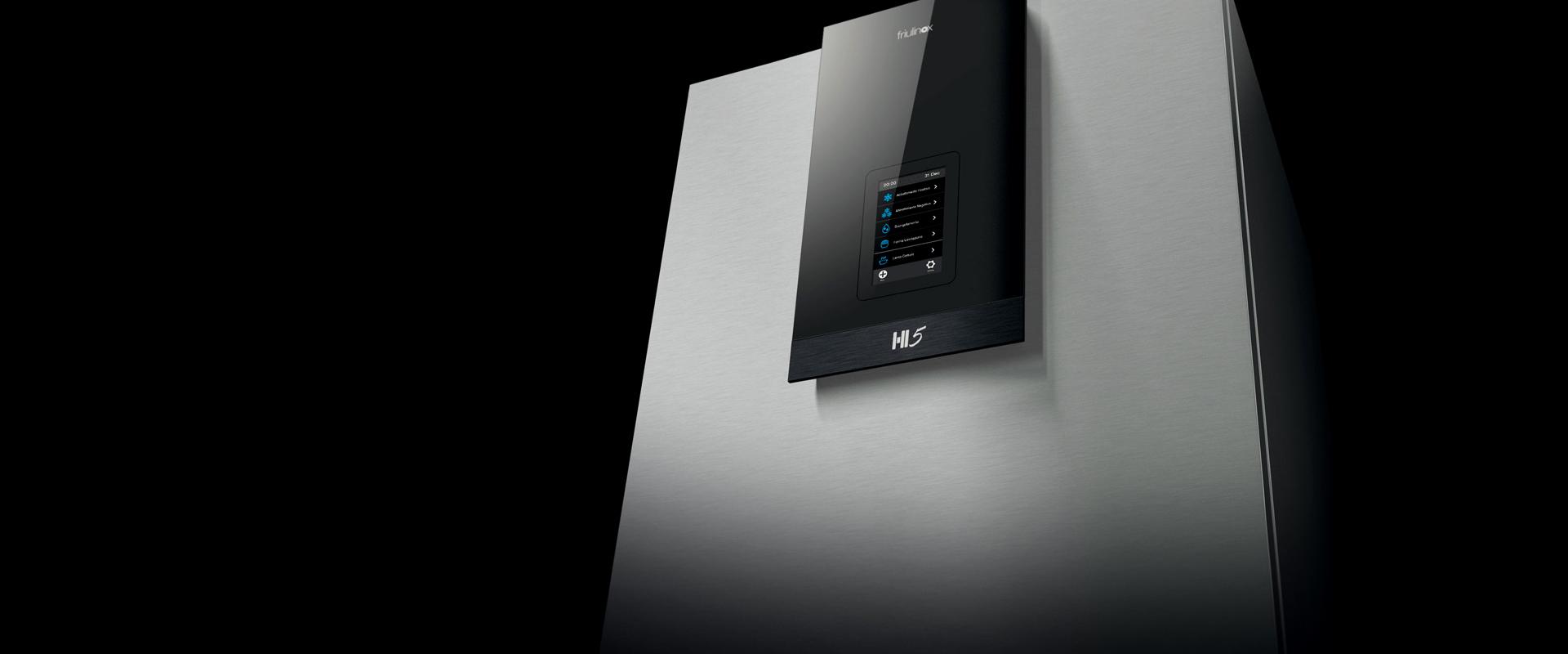
Studio Volpi partnered with Friulinox and Hiber for the design of their top product, the first pentavalent blast chiller on the market, designed for bread and pastry making, which embodies blast chilling, blast freezing, thawing, proofing retarder and low temperature cooking functions.
Together with that, we were assigned the task of creating of the communication tools, namely the catalogues and the booths for the annual trade show.
Challenge
The main objective of this project was creating two versions of the same product in order to diversify their distribution channels, while optimizing the designing and the manufacturing.

Solution
We opted to maintain the same design guidelines for both versions of the product, differentiating the logos and the communication materials.
Our experience in professional cooking equipment, where functionalities and performance count the most, guided us in our research activity, focused on product usability, icons and interfaces, followed by a deep analysis of design and materials.
We emphasized the interface to make it iconic and recognizable, and created a common language with the product: the screen support is a superflat, minimal, high-tech element, while the blast chiller, characterised by a black, plastic-made grid, is related to the technical part, to the engine and its performances.
We designed the icons, minimal and modern, accordingly to the product’s personality.


In parallel with our design activities, our branding team was also involved in the creation of the two logos to be presented at Sigep 2015.
For Friulinox, we chose the name “Hi5”, referring to the 5 functions it embodies, while for Hiber we chose “The One”, underlining the uniqueness of the product.


The square format of the catalogues resembles the shape of the blast chiller. They have glossy finishes and coated paper, reminiscent of hi-tech, counter positioned to a poetic narration obtained through food pictures. In Hi5’s catalogue, the photographs emerge from a black background, in contrast with the very bright colours of the food, while The One’s version has a grey metallic setting combined with desaturated images.
For the presentation at the trade fair, we created two different booths.
For Friulinox we recreated a warm atmosphere, which made the booth to look like a bakery: wood, flour sacks, pots and bread loafs gave it a cosier and more rustic character

On the other hand, Hiber’s booth had a very high-tech and minimal look: the predominant element was steel, with black niches where the products were placed.


