Studio Volpi for IARP: A Brand New Visual Brand Language and Design Guidelines Reposition the IARP brand image and define new guidelines through modern and suggestive design. Epta Group is a multinational company that is synonymous with progression, sustainability and excellence all over the world. Specialized in commercial refrigeration for the GDO, the group pushes itself to develop new technologies where they are able to anticipate the trends and needs of the resellers. It diversified itself by actively operating in the Food & Beverage market with the acquisition of IARP in 2013. Iarp products are the result of Plug-in power, the secret formula for actively involving potential Customers with the products on display, to improve the image and profitability of Food & Beverage and Ho.Re.Ca operators. With their modern design and elegant forms, Iarp plug-ins can satisfy requirements for versatility and display flexibility within all premises and also provide high levels of sustainability, through the use of natural refrigerants and technical components with improved energy efficiency. Finally, the details make the difference - with Iarp's ability to digitally print straight onto steel the options for extreme personalization are enormous. We have interviewed Roberto Manzari, Studio Volpi's Senior Designer who has designed this project.  - What was the request of IARP? IARP came to Studio Volpi to redefine the image of its product line, starting with a range of refrigerators that would reflect the stylistic guide lines of the brand. Joy - semi vertical, without windows or barriers between the product and client Delight - horizontal refrigerator to be used by operator (for ice cream) Glee - closed vertical refrigerator to display products Joy, Glee and Delight are part of the Emotions range from IARP studied to give maximum visibility to the products on display and to motivate clients to purchase them.
What was the starting point of the project?
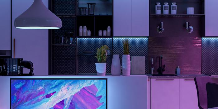
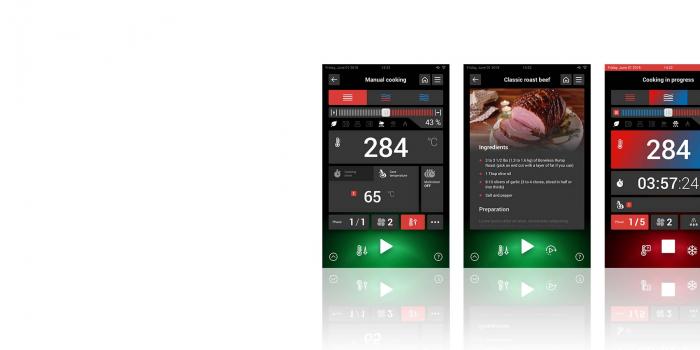
One of the most important phases, we began with research and analysis, which allowed us to understand the market and create a repositioning strategy with IARP focused on the new identity of the products. The work of the design team at Studio Volpi was concentrated on finding new aesthetic motives combining clean and modern lines with the use of lighting as an attraction for the consumer.  - What was your inspiration for designing the new product line? The main idea behind the new design consists of being able to use the light as an identificative element, creating a luminous frame that not only renders the refrigerator recognizable, but also highlights the product that is being displayed. The user interface was then completely redesigned in order to make it more integrated and usable for the operator.
  - In terms of aesthetic taste, what inspires you? What is your design style? I've always been fascinated by products that tell a story. Especially those that create a connection between the user and redefine the way in which we interact. I'm always convinced that semplicity represents a strong value, especially in an age where objects have to be ready to communicate for themselves and create an efficient user experience. VIEW COMPLETE PROJECT HERE
-

-

-

Perspectives Mar 30, 2020
KITCHEN 4.0: HOW DIGITALIZATION IS CHANGING THE RULES
Technological updating and the integration of an interconnected soul are turning modern professional kitchens into a perfect example of the 4.0 industry, where the product and its super digital powers become a tool to improve working conditions, enhance productivity, monitor the processes to achieve better results and create new business models


